Disclosure: Some of the links below are affiliate links, meaning that at no additional cost to you, I will receive a commission if you click through and make a purchase. For more information, read our full affiliate disclosure here.
If you don’t already have Squarespace, try it for free! Squarespace makes it ridiculously simple to create and showcase your courses with themes specifically designed for selling education.
CASEY BOTTICELLO
Founder, Blogging Guide

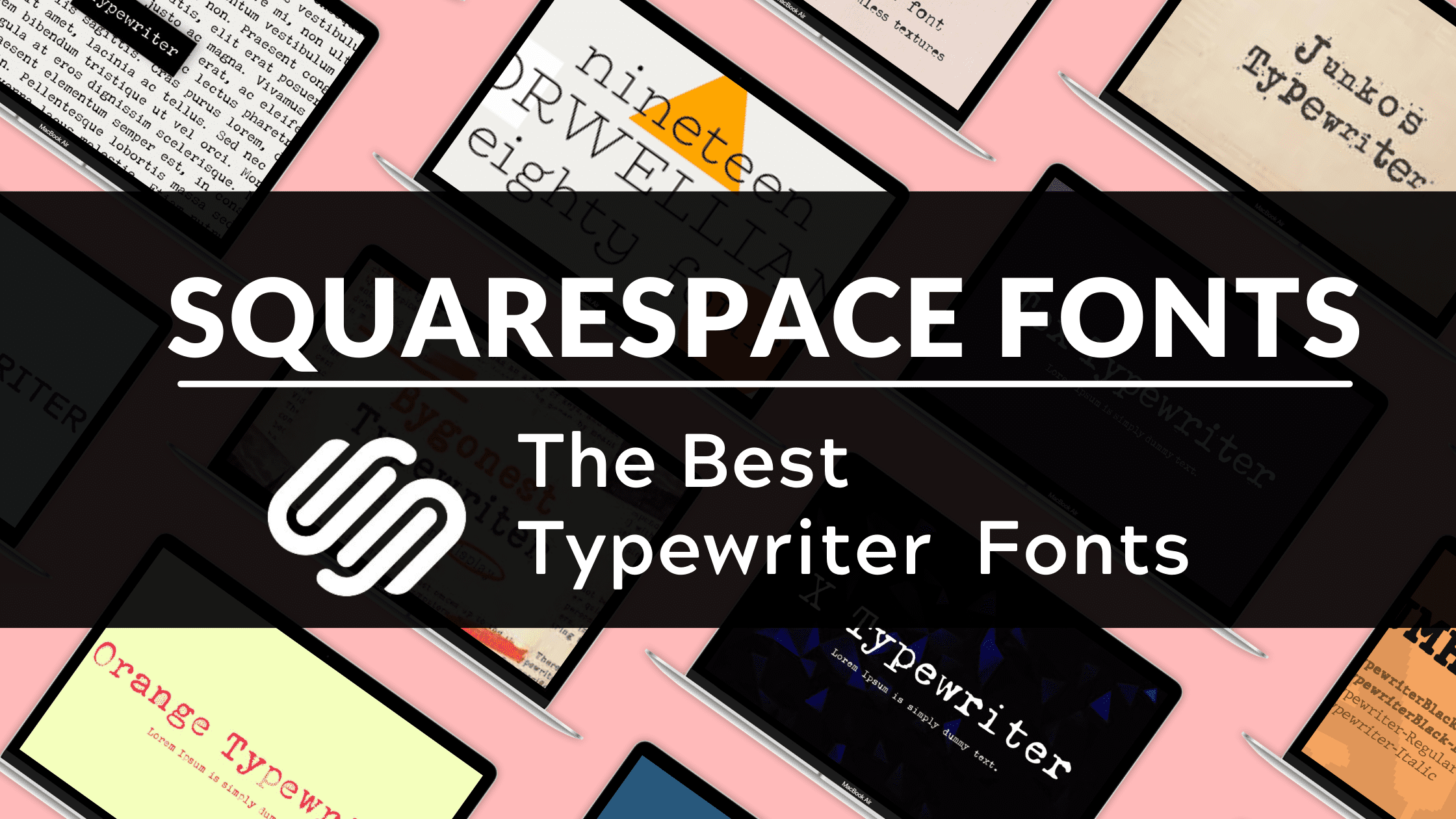
Squarespace is among the most popular website builders around. With millions of users and counting, it has set itself apart by placing an emphasis on creativity and beautiful design. There is a lot on offer in these areas for anyone looking to launch an eye-catching website. One of the most interesting features are the custom fonts that designers can pick from when building their website. This guide will cover the best Squarespace font combinations!
Best Squarespace Font Combinatons
1. Muli & Oswald
")
Muli is a free, open-source sans-serif typeface designed by the prolific Vernon Adams, creator of numerous other open-source fonts available on Google Fonts. Muli is a nice typeface but lacks a bold weight, so it’s not really suitable for a body font.
Oswald is a reworking of the classic style historically represented by the ‘Alternate Gothic’ sans serif typefaces. The characters of Oswald were initially re-drawn and reformed to better fit the pixel grid of standard digital screens. Oswald is designed to be used freely across the internet by web browsers on desktop computers, laptops, and mobile devices.
2. Lora & Oswald
")
Lora is a well-balanced contemporary serif with roots in calligraphy. It is a text typeface with moderate contrast well suited for body text.
Oswald is a reworking of the classic style historically represented by the ‘Alternate Gothic’ sans serif typefaces. The characters of Oswald were initially re-drawn and reformed better to fit the pixel grid of standard digital screens. Oswald is designed to be used freely across the internet by web browsers on desktop computers, laptops, and mobile devices.
3. Red Hat Display & Bebas Neue
")
Red Hat is a family of typefaces produced in 2 optical sizes and a monospace style, in a range of weights with italics. The fonts were originally commissioned by Paula Scher, Pentagram, and designed by Jeremy Mickel, MCKL for the new Red Hat identity.
Bebas Neue is a display family suitable for headlines, captions, and packaging, designed by Ryoichi Tsunekawa. It’s based on the original Bebas typeface. The family is suitable for pro users due to its extended character set and OpenType features.
4. Cinzel & Noto Sans
")
Cinzel is a typeface inspired by first-century roman inscriptions and based on classical proportions. However, it’s not simple revivalism, while it conveys all the ancient history of the Latin alphabet it also merges a contemporary feel onto it.
Noto is a global font collection for writing in all modern and ancient languages. Noto Sans is an unmodulated (“sans serif”) design for texts in the Latin, Cyrillic, and Greek scripts, which is also suitable as the complimentary choice for other script-specific Noto Sans fonts.
5. Raleway & Open Sans
")
Raleway is an elegant sans-serif typeface family. Initially designed by Matt McInerney as a single thin weight, it was expanded into a 9-weight family by Pablo Impallari and Rodrigo Fuenzalida in 2012 and iKerned by Igino Marini. A thorough review and italic were added in 2016.
Open Sans is a humanist sans serif typeface designed by Steve Matteson, Type Director of Ascender Corp. This version contains the complete 897 character set, which includes the standard ISO Latin 1, Latin CE, Greek, and Cyrillic character sets. Open Sans was designed with an upright stress, open forms, and a neutral, yet friendly appearance. It was optimized for print, web, and mobile interfaces, and has excellent legibility characteristics in its letterforms.
6. Merriweather & Muli
")
Merriweather was designed to be a text face that is pleasant to read on screens. It features very large x-height, slightly condensed letterforms, mild diagonal stress, sturdy serifs, and open forms.
Muli is a free, open-source sans-serif typeface designed by the prolific Vernon Adams, creator of numerous other open-source fonts available on Google Fonts. Muli is a friendly typeface but lacks a bold weight, so it’s not really suitable for a body font.
7. Unica One & Crimson Pro
")
Unica One is a condensed unicase sans serif style. Good performance for composing headlines and short texts. Readability and simplicity are some of the virtues of this unique typeface.
Crimson Pro is a serif typeface family: Contemporary, clear, classic, and rounded/open. Something for a college textbook, editorial websites, and any reading experience with book-length texts It contributes to the tradition of beautiful Garamond-inspired typefaces, often called “Garalde” or “Old Style,” and has 8 named weights, in Roman and Italic, and is available as a Variable Font with a Weight axis.
8. Permanent Marker & Overpass Light
")
Permanent Marker represents the look and feel of a favorite writing instrument.
The overpass is a free, Open Source typeface designed by Delve Fonts. The design of the Overpass is an interpretation of the well-known “Highway Gothic” letterforms from the Standard Alphabets for Traffic Control Devices published by the U.S. Federal Highway Administration.
9. Playfair Display & Open Sans
")
Playfair is a transitional design. In the European Enlightenment in the late 18th century, broad nib quills were replaced by pointed steel pens as the popular writing tool of the day. Together with developments in printing technology, ink, and paper making, it became to print letterforms of high contrast and delicate hairlines that were increasingly detached from the written letterforms.
Open Sans is a humanist sans serif typeface designed by Steve Matteson, Type Director of Ascender Corp. This version contains the complete 897 character set, which includes the standard ISO Latin 1, Latin CE, Greek, and Cyrillic character sets. Open Sans was designed with an upright stress, open forms, and a neutral, yet friendly appearance. It was optimized for print, web, and mobile interfaces, and has excellent legibility characteristics in its letterforms.
10. Rufina & Roboto
")
Rufina combines features of several typographic styles with Bodoni forms found in the calligraphy of flexible tip pens. High contrast enables it to work well in text and headlines.
Roboto has a dual nature. It has a mechanical skeleton and the forms are largely geometric. At the same time, the font features friendly and open curves. While some grotesks distort their letterforms to force a rigid rhythm, Roboto doesn’t compromise, allowing letters to be settled into their natural width. This makes for a more natural reading rhythm more commonly found in humanist and serif types.
Conclusion
Squarespace is a leading all-in-one website building and ecommerce platform that enables millions to build a brand and transact with their customers in an impactful and beautiful online presence. I hope that you found this tutorial on the best Squarespace font combinations, useful.