Best Fonts in Figma

Written by Casey Botticello
Disclosure: Some of the links below are affiliate links, meaning that at no additional cost to you, I will receive a commission if you click through and make a purchase. Read our full affiliate disclosure here.
Great graphic design is powered by great font selection. But picking great fonts is a challenge most people. Luckily, Figma has made adding great fonts to your designs much easier. In this tutorial, our team of design experts will cover the best fonts in Figma. This is very useful to anyone who is looking for the perfect font combination in Figma for their graphic design work.
Best Fonts in Figma
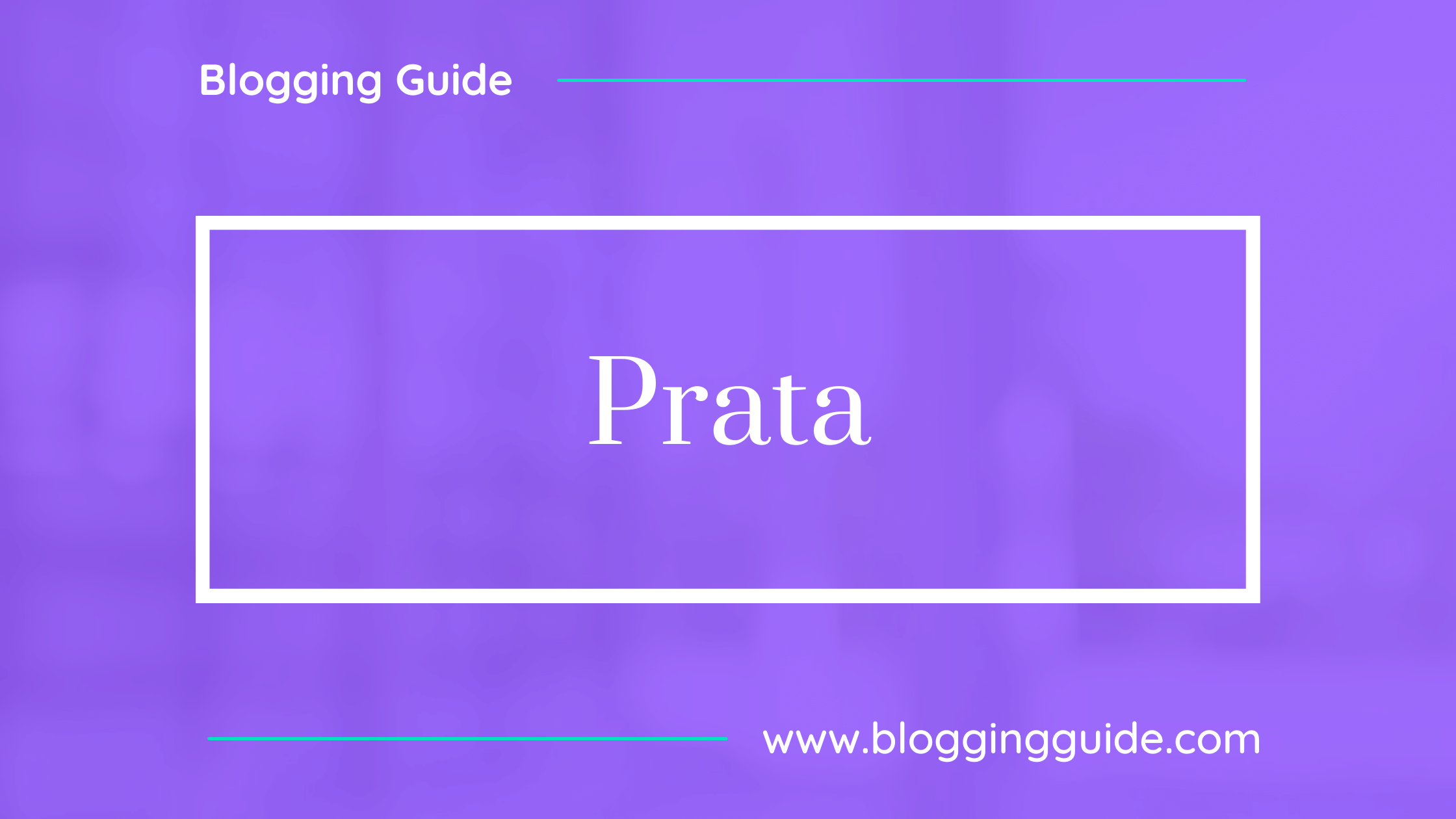
1. Prata
Prata is an elegant Didone typeface with sharp features and organic teardrops. There is a certain tension in the contrast of its virile serifs and soft refined curves.
Its triangular serifs complement and accent the thin strokes, and the high contrast means it will work best in display sizes.
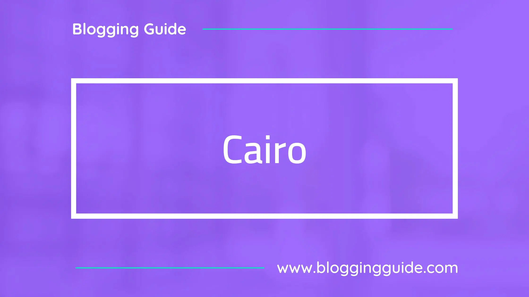
2. Cairo
Cairo balances classic and contemporary tastes with wide open counters and short ascenders and descenders that minimize length while maintaining easy readability.
The lighter weights can be used for body text while the heavier weights are perfect for headlines and display typography. The Arabic component has a wide glyph set that supports the Arabic, Farsi, and Urdu languages.
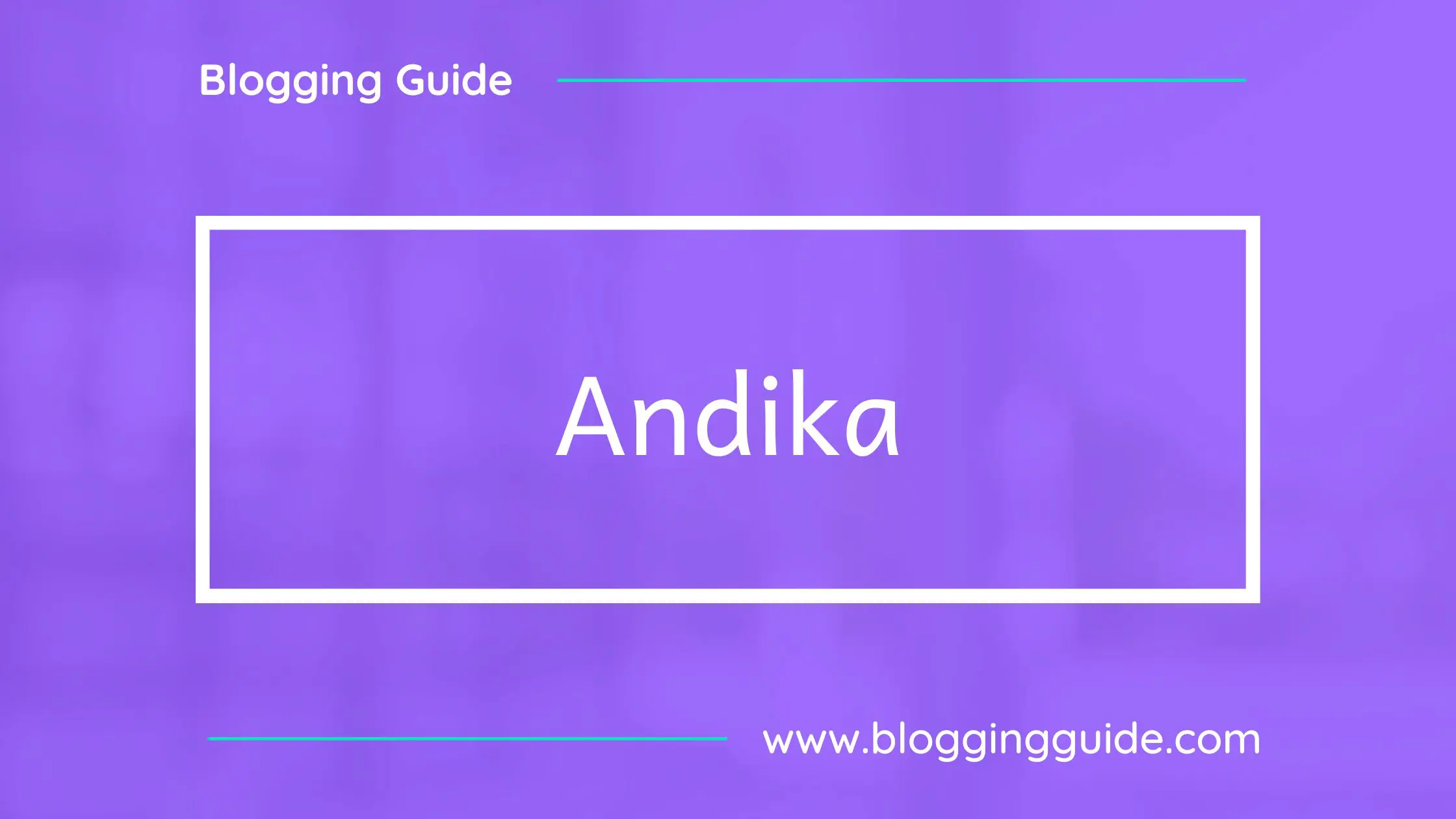
3. Andika
Andika is a sans serif, Unicode-compliant font designed especially for literacy use, taking into account the needs of beginning readers. The focus is on clear, easy-to-perceive letterforms that will not be readily confused with one another.
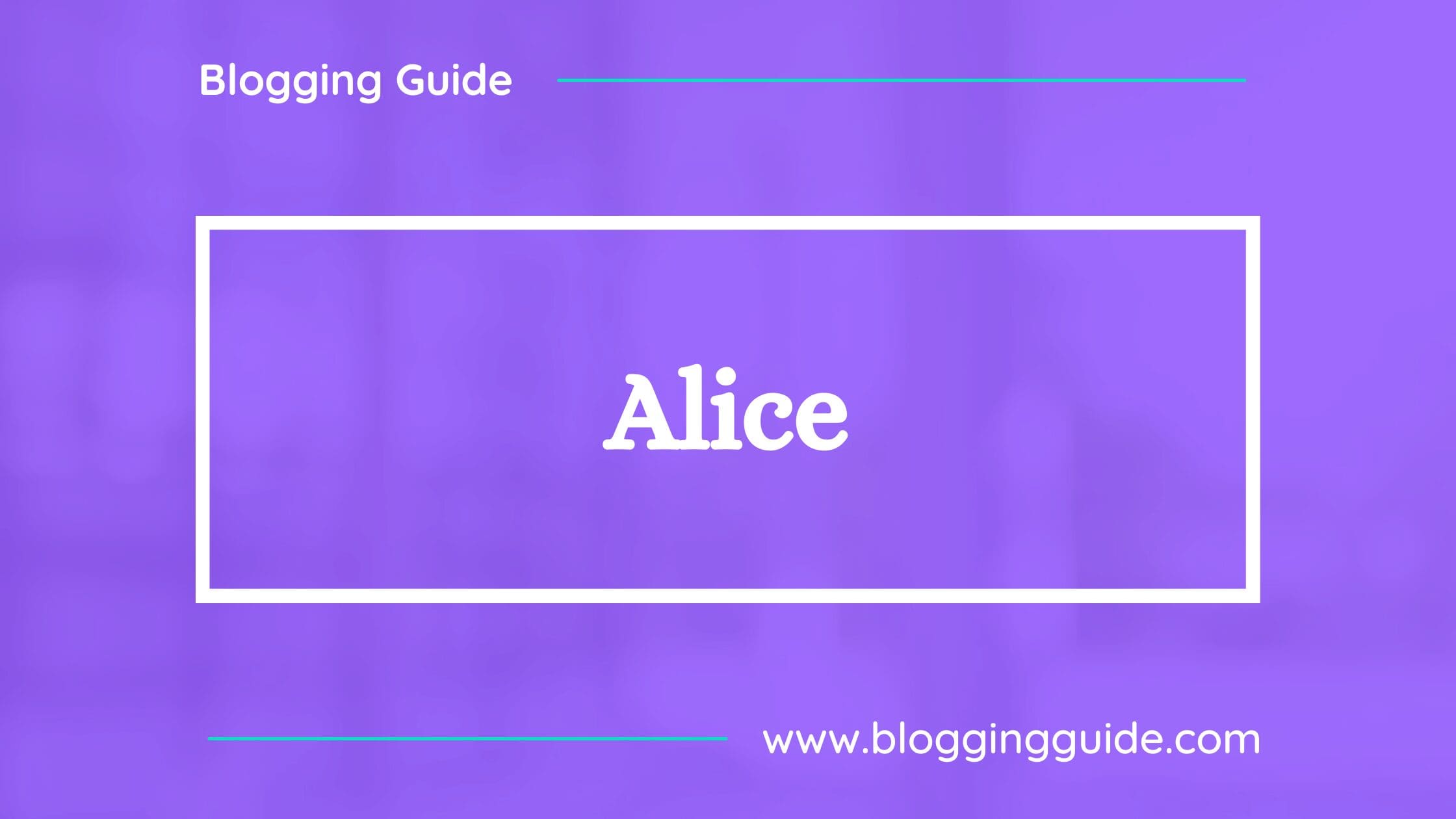
4. Alice
Alice was designed by Ksenia Erulevich, who was inspired by Lewis Carrol’s novel and decided to make a typeface that will be suitable for typesetting that book.
It came out eclectic and quaint, old-fashioned, having widened proportions, open aperture, and soft rounded features; perfect for long meditative text-setting and headlines.
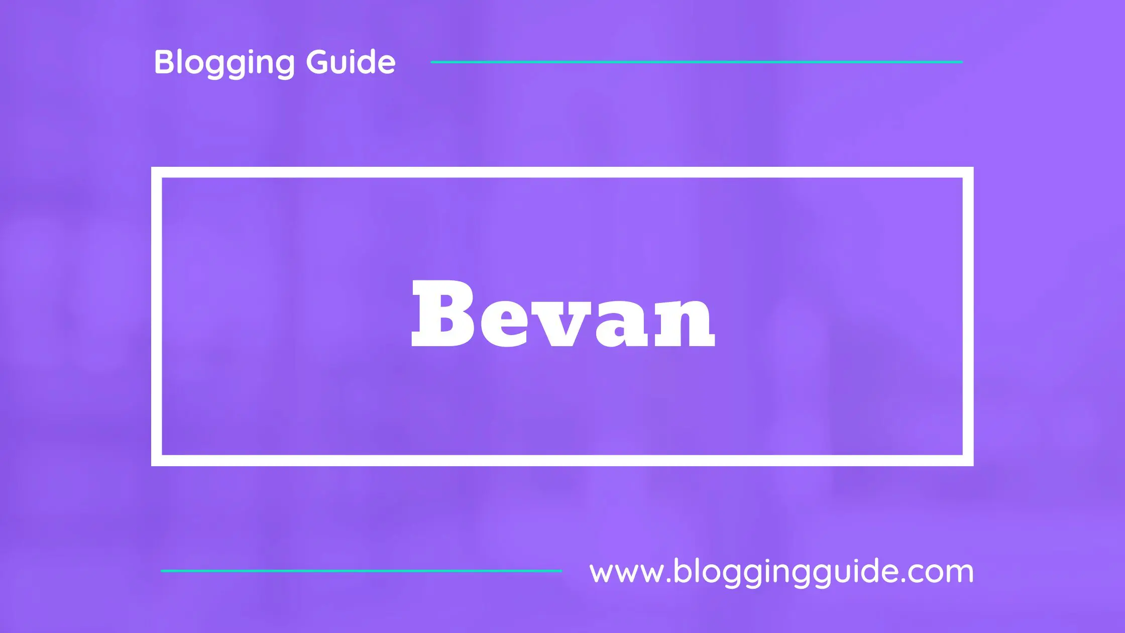
5. Bevan
Bevan is a reworking of a traditional slab serif display typeface created by Heinrich Jost in the 1930s.
In Bevan, Jost’s earlier letter forms have been digitized and then reshaped for use as a Webfont, the counters have been opened up a little and the stems optimized for use as a bold display font in modern web browsers.
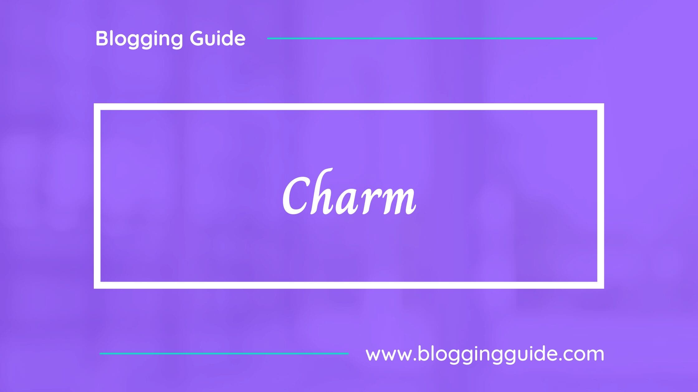
6. Charm
Charm is a handwritten Thai and Latin family.
The letterforms were created using a flat tip pen on paper. It works well for Thai religious texts.
7. Coiny
Coiny is a typeface designed originally for the Latin and Tamil scripts in parallel. Naturally bold, and born on the street to shine on screen.
It has a structure based on simple geometrical shapes and is inspired by the vernacular designs seen around every big city. The forms are similar to those found with writing made with a rounded brush point. It is a lot of fun for titles and headlines.
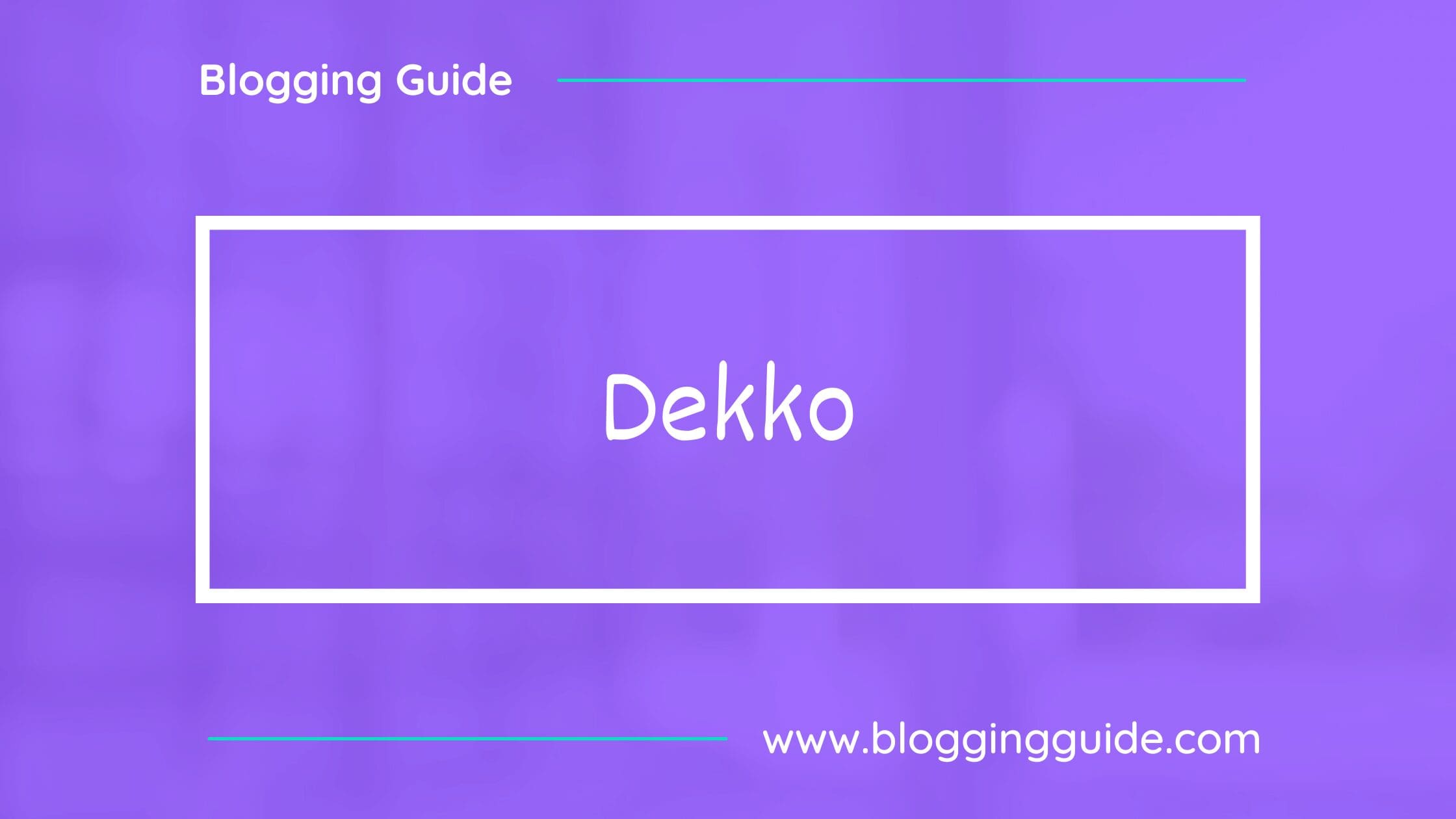
8. Dekko
Dekko’s personality is both warm and casual. It originated with Modular InfoTech’s 4948 and was modified to feel more written and regular in appearance and weight.
The inter-letter spacing of the design is now wider, allowing for it to be used at smaller sizes on screens.
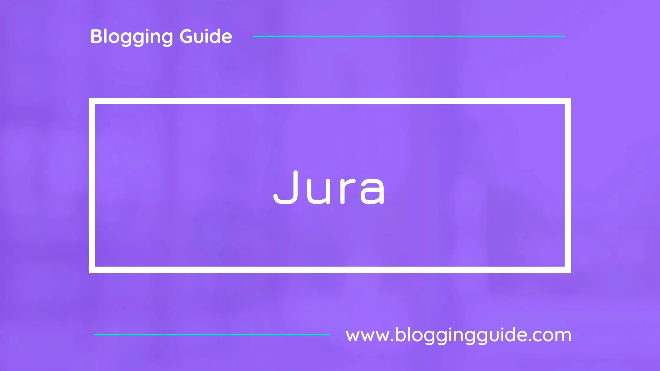
9. Jura
Jura is a classic font. The Latin alphabet is using the same kinds of strokes and curves as the Kayah Li glyphs, and thus Jura was born.
It has been expanded to include glyphs for the Cyrillic and Greek alphabets as well.
10. Maitree
Maitree means “friendliness” in Thai. Maitree is a serif Latin and looped Thai typeface with wide proportions. It is characterized by its bigger-than-usual looped terminal in Thai, and long serifs in Latin, that balance out the whole structure.
Maitree offers 6 weights, and its asymmetrically curved terminals are well-suited for both formal and casual usage, especially for works that require an antique and historical manner.
