Best Fonts in Word

Written by Casey Botticello
Disclosure: Some of the links below are affiliate links, meaning that at no additional cost to you, I will receive a commission if you click through and make a purchase. Read our full affiliate disclosure here.
Great graphic design is powered by great font selection. But picking great fonts is a challenge most people. Luckily, Word has made adding great fonts to your designs much easier. In this tutorial, our team of design experts will cover the best fonts in Word.
Best Fonts in Word
1. PT Serif
PT Serif™ is the second pan-Cyrillic font family developed for the project “Public Types of the Russian Federation.” The first family of the project, PT Sans, was released in 2009.
2. Sorts Mill Goudy
Sorts Mill Goudy is a revival of Frederic Goudy’s ‘Goudy Oldstyle’ with Regular and Italic styles, and extended Latin character coverage.
3. GFS Didot
GSF Didot was designed by the famous French typecutter Firmin Didot, a new Greek typeface in Paris in 1805, under the influence of the neoclassical ideals of the late 18th century. It was immediately used in the publishing program of Adamantios Korai, the prominent intellectual figure of the Greek diaspora and leading scholar of the Greek Enlightenment.
4. Courier Prime
Courier Prime is a new take on IBM’s Courier which was designed in 1956 by Howard Kettler.
5. David Libre Regular
David Libre is a Libre David Hebrew, based on David Hadash Formal, released by Monotype Corporation in 2012. David Hadash Formal is modern digitization made from original large-scale technical drawings for the typeface drawn by Ismar David.
6. Cardo
Cardo contains features that are required for high-quality typography such as ligatures, text figures (also known as old-style numerals), true small capitals, and a variety of punctuation and space characters.
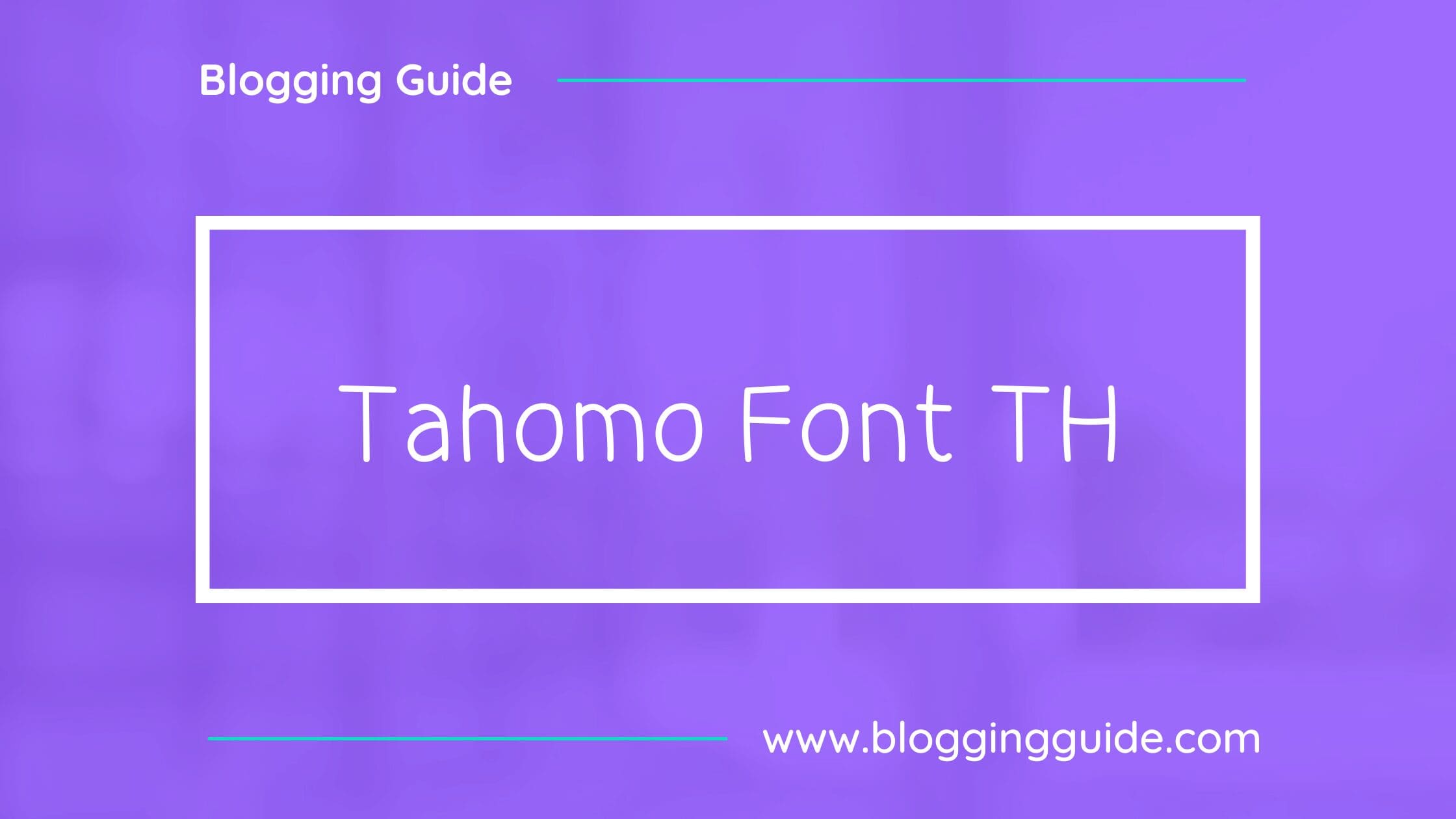
7. Tahomo Font TH
Tahoma is a humanist sans-serif typeface that Matthew Carter designed for Microsoft Corporation. Microsoft first distributed it, along with Carter’s Verdana, as a standard font in the initial release of Windows 95. Tahoma is often compared with Fruiter, another humanist sans-serif typeface.
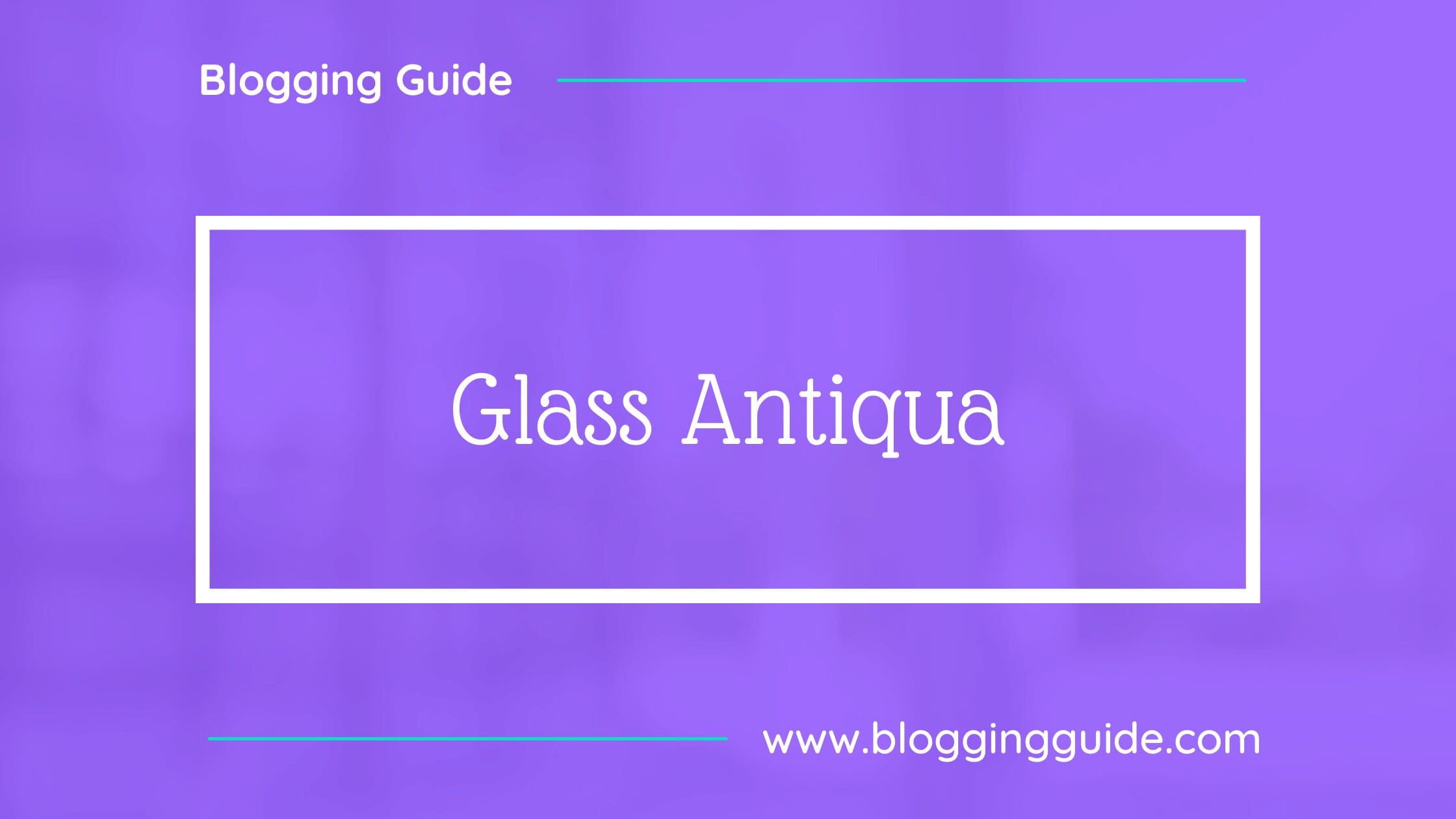
8. Glass Antigua
Glass Antiqua is a revival of the 1913 typeface “Glass Antiqua” by “Genzsch & Heyse” found in the Taschen book “Type: A Visual History of Typefaces and Graphic Styles, 1901-1938.” A magnificent and unique design with a Jugenstile fleur, combining Slab Serif and Antiqua, plus elements of cursive calligraphy.
9. Arturo
Arturo is a sans serif family designed by Francesco Canovaro as part of his research on the digital reinvention of handmade brush lettering.
10. Calistoga
Calistoga is a cheerful, space-saving display typeface. It was inspired by Oscar M. Bryn’s lettering as seen on the posters made for the Western US-based Santa Fe Railroad. Its vintage railroad flavor is found in the whole design.


