Disclosure: Some of the links below are affiliate links, meaning that at no additional cost to you, I will receive a commission if you click through and make a purchase. Read our full affiliate disclosure here.
Best Heavy Fonts in Canva
2. Raleway Heavy
Raleway Heavy is a display face that features both old style and lining numerals, standard and discretionary ligatures, a pretty complete set of diacritics, as well as a stylistic alternate inspired by more geometric sans-serif typefaces than its neo-grotesque inspired default character set.
8. Geometra Heavy
Geometra is a new font family from Swedish type designer Bo Berndal and the T4 font foundry. Somewhere between a slab serif and a sans it has a crisp, geometric feel and is both 20’s retro and modern. Its soft curves and openness make it very readable in smaller print. The powerful serifs give the font lots of characters in larger sizes. Geometra comes in three weights, regular, semibold, and bold.
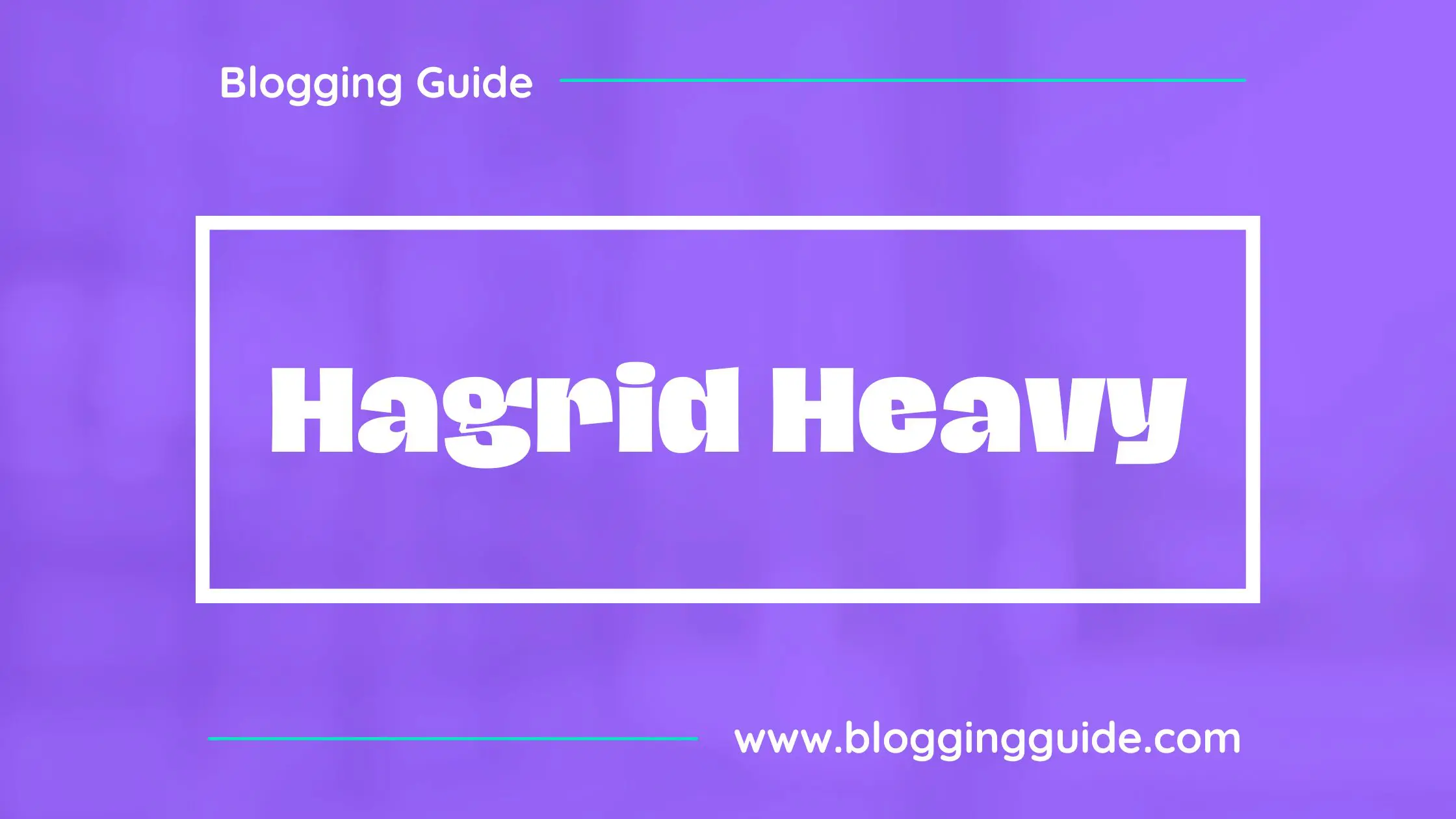
10. Hagrid Heavy
Hagrid is a typeface designed for editorial & display use, bringing dynamism to the printed and digital page thanks to its extreme contrast and unique details. It has been developed in a range of six display weights ranging from the monolinear and more traditional thin to the expressive heavyweight. For better readability in small sizes and on the web, a companion text family has been developed, with a slightly different selection of weights, wider metrics, and fine adjustments to keep the dynamic expressivity of the design without sacrificing legibility.
Conclusion
I hope you found this tutorial covering the best heavy fonts in Canva, useful! Click here to read our comprehensive Canva Guide. If you haven’t tried CanvaPro, click here to try it for free for 30 days through our exclusive offer! Below are several related Canva tutorials that you might find useful.
