Canva Charts: How to Create Charts in Canva

Written by Casey Botticello
Disclosure: Some of the links below are affiliate links, meaning that at no additional cost to you, I will receive a commission if you click through and make a purchase. For more information, read our full affiliate disclosure here.
Charts enable you to visually compare multiple sets of data. Many people understand a picture more quickly than blocks of text. In fact, research has shown that people process visuals 60,000 times faster than text. A compelling chart can help you make your point more convincingly and lend credibility to your content. This article will explore Canva charts and explain how to create charts in Canva.
How to Create Charts in Canva
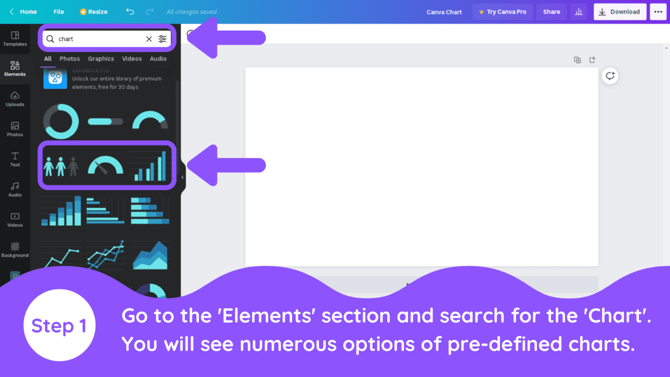
1. Search for Charts Under Elements
Go to the Element section on the left menu and search for the ‘Chart’. You will see many options of pre-defined charts.
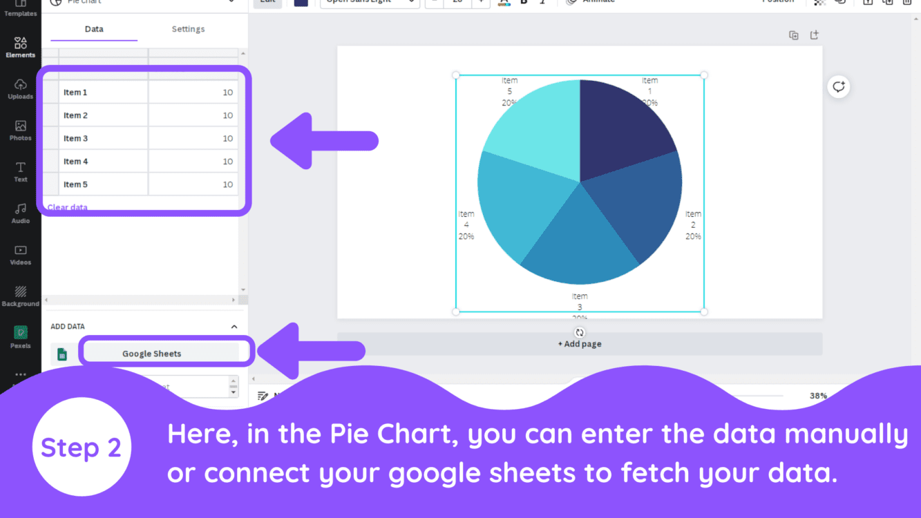
2. Select Your Chart Type
Select any of the charts. In this example, we are creating a pie chart. If you have your data ready in Google Sheets, you can directly connect to your sheet as well. The other way you can enter your data is manually, by directly entering the numbers into the data boxes.
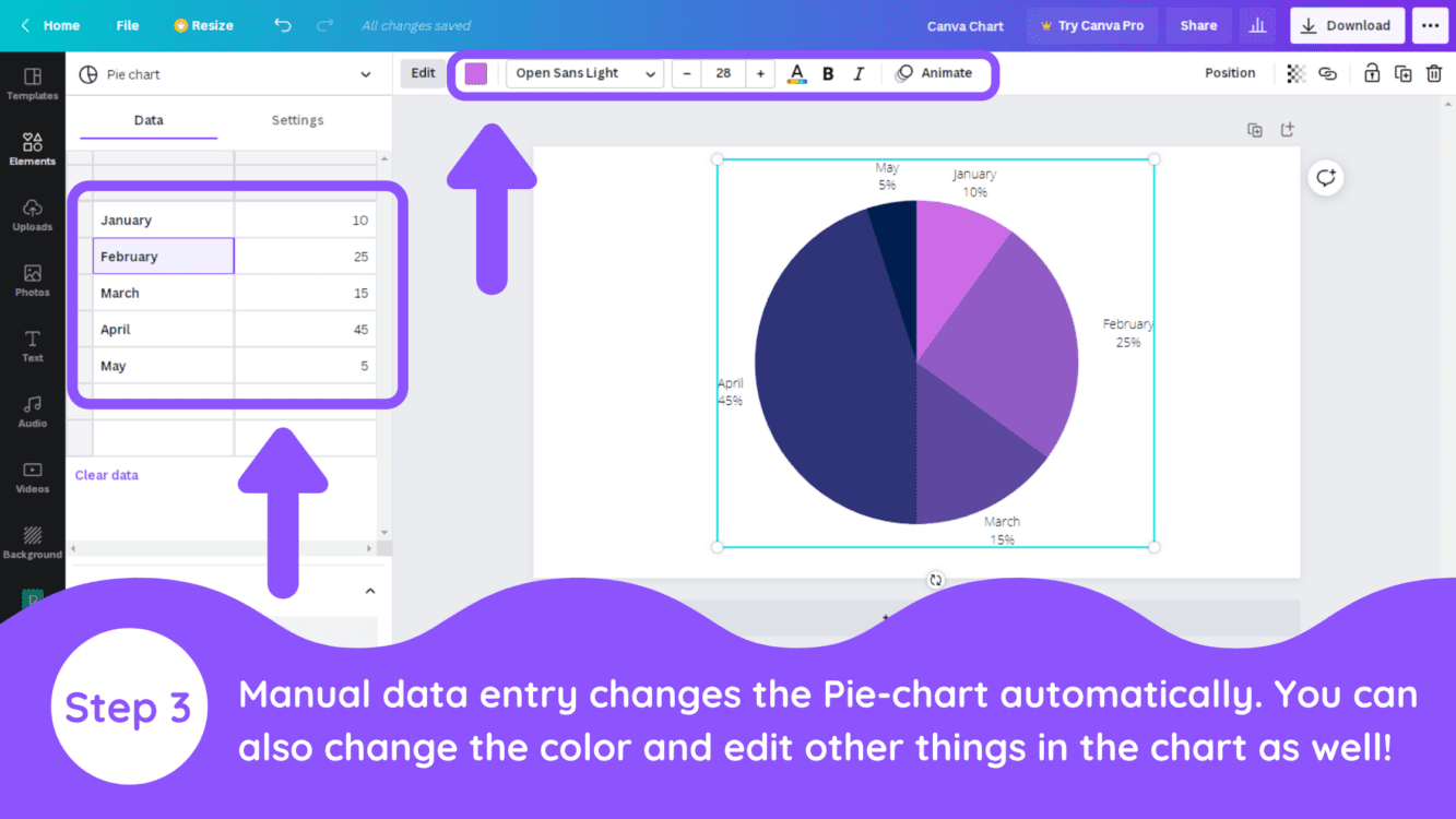
3. Enter Data & Edit Chart
You can add the data in the boxes and you will see the chart automatically begin to auto-format itself. You can also adjust the color of your chart, the font used for data labels, and the size of the chart.
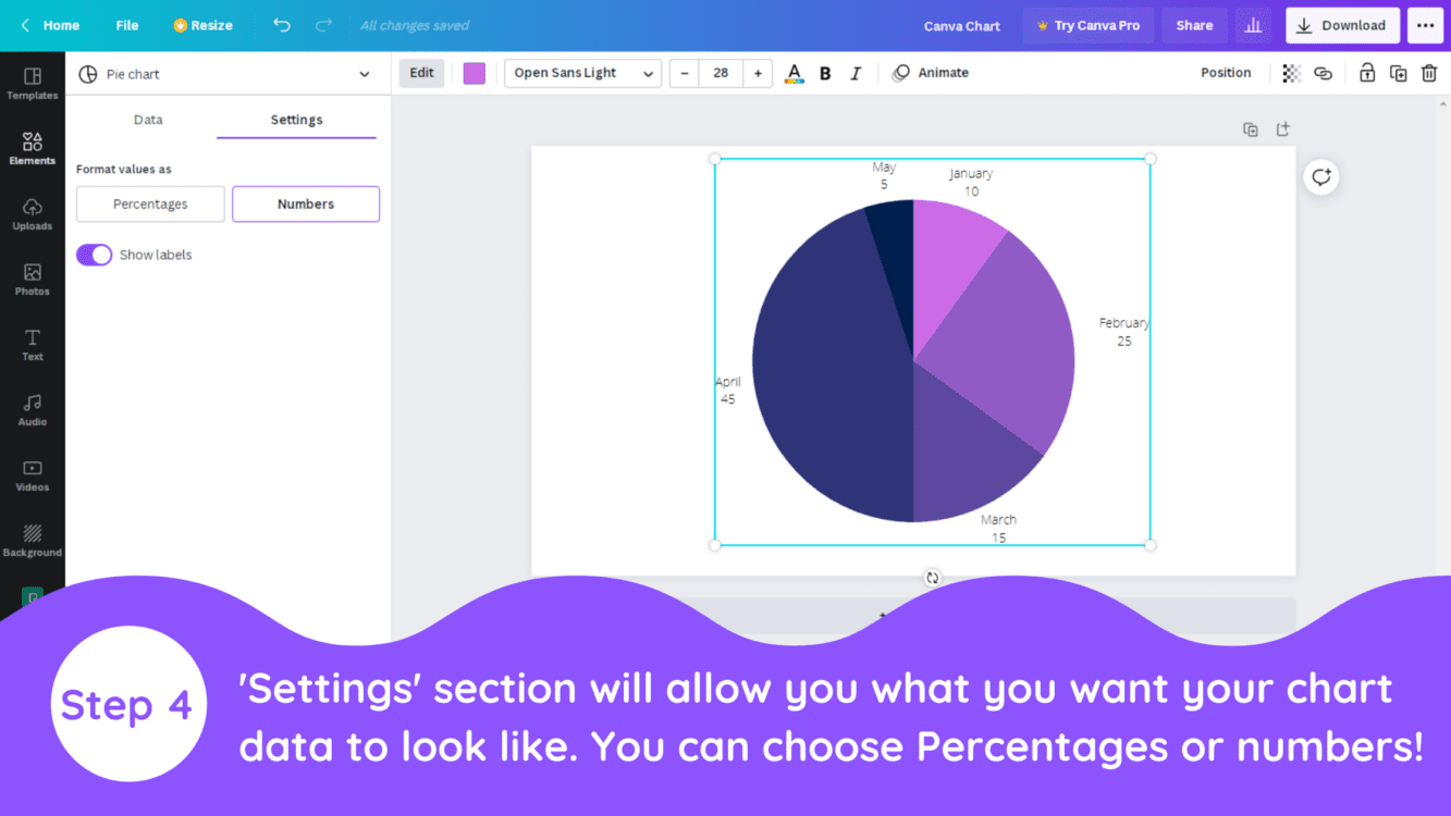
4. Customize Chart Details & Settings
You can also use the ‘Settings’ button for changing the way your data looks. You can format your chart to display values as percentages or numbers.
Conclusion
Canva is an amazing graphic design tool, and I hope you found this tutorial on how to create charts in Canva, useful! Click here to read our comprehensive Canva Guide. If you are interested in downloading Canva or trying Canva Pro for free, click here. Below are several related Canva tutorials that you might find useful:
